May 3, 2026 · 12 min read
Remove Background for YouTube Thumbnails: Boost CTR 30%+ (2026)
YouTube thumbnail background removal in 2026: a free AI workflow to isolate faces and objects and lift click-through rate by 30% or more. No Photoshop.
Open YouTube. Scroll the homepage for thirty seconds. Almost every thumbnail above 100,000 views uses the same visual recipe: a person or object cut cleanly from its original background, placed on a high-contrast solid color, with three to five words of giant text. It is not coincidence. The format works because YouTube's feed is a sea of natural photographic backgrounds, and a cutout on a flat color visually breaks that pattern. Pattern-breakers earn clicks; clicks earn impressions; impressions earn the next round of clicks. The flywheel starts with the thumbnail.
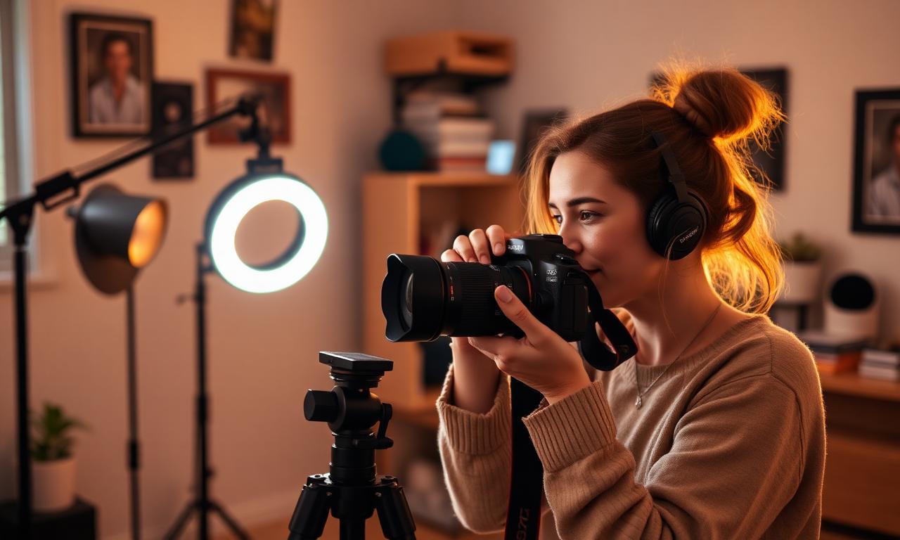
The good news for creators in 2026: producing this style of thumbnail used to require Photoshop and twenty minutes per video. Today the entire workflow takes five minutes in a browser, costs nothing, and runs entirely on your own device. This guide walks through the exact process, the design rules that hold up to mobile-feed scrutiny, and the mistakes that quietly cost CTR.
Why isolated subjects win attention
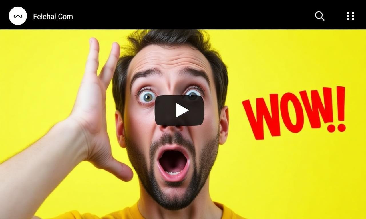
- Faces grab attention faster than scenes. A century of human-perception research, summarised in Nielsen Norman Group's "Faces Attract Attention", shows the eye locks onto a face within 100 ms.
- Solid backgrounds stand out in YouTube's photographic grid. Almost every other thumbnail is a busy scene; a flat color reads as "different" instantly.
- Cutouts let you exaggerate scale. A giant surprised face takes 50% of the frame; impossible in a real photo.
- Cutouts let you exaggerate emotion. Crop, scale, and angle independently of the original photo's composition.
YouTube accepts JPG, PNG, GIF, BMP up to 2 MB. Use JPG at quality 90 for photographs, PNG for designs with hard-edged graphics or text-only thumbnails. WebP is not yet accepted by YouTube's uploader, even though the player serves WebP to viewers see PNG vs WebP for transparent images for the broader format discussion.
The 5-minute thumbnail workflow
Here's the entire pipeline, end to end, for a single thumbnail:
- Shoot or pick a clear, well-lit photo of your face or the main object of the video.
- Run it through MagicBG for a transparent PNG (2–4 seconds, free, in your browser).
- Open Canva or Photopea, set the canvas to 1280×720 (YouTube's recommended size).
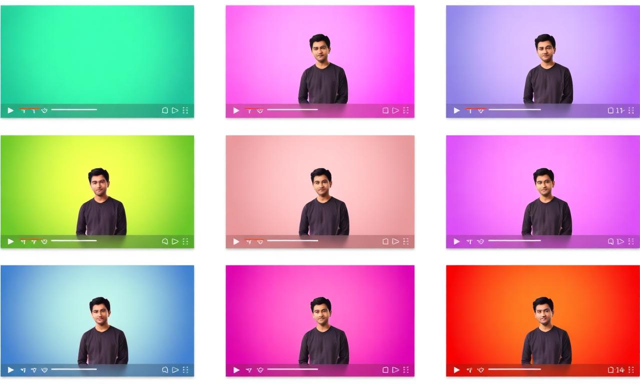
- Pick a high-contrast background color or a two-stop gradient.
- Drop the cutout in, scale it to fill 50–70% of the frame.
- Add 3–5 words of text in a heavy sans-serif font, 120–180 pt.
- Export as JPG at quality 90, under 2 MB.
Why a browser-based AI tool fits this workflow
You don't want a desktop app for this. You want a tab you can keep open and return to once a week. The tool needs to handle hair, headphones, microphones, glasses, and complex backgrounds without manual mask cleanup. Modern in-browser segmentation models (the same family of models we explain in How AI Background Removal Actually Works) handle all of these cases on the first pass.
Design rules that survive mobile
More than 70% of YouTube watch time is on mobile, where thumbnails render at roughly 240px wide. The thumbnail you design at 1280×720 in Photopea will be displayed five times smaller. Every design choice has to survive that shrink.
Color
Yellow (#FFD400), red (#FF1F1F), neon green (#39FF14), hot pink (#FF1493). These four colors carry 90% of high-CTR thumbnails for a reason: they punch through YouTube's mostly-grey UI. Avoid pastels — they disappear. Avoid white — it blends with the page background. Avoid black — it blends with dark mode. Reserve those for accents only.
Typography
- Heavy sans-serif. Inter Black, Bebas Neue, Anton, Impact. Anything below 700 weight disappears at thumbnail size.
- 3 to 5 words. Anything more is illegible at 240px wide.
- White or yellow fill, with a 4–8 pixel black stroke. The stroke is what makes text readable on any background YouTube might place behind it.
- Free fonts that work consistently: Inter, Anton, Bebas Neue.
Composition
- Subject on one side, text on the other. Splitting the frame in two is the most reliable layout.
- Look at — or away from — the text. Eye-line direction is a powerful subconscious pointer.
- Leave the bottom-right corner relatively quiet; YouTube overlays the video duration there.
Cutout quality is half the battle
A halo of grey background around your subject screams "amateur" louder than any other thumbnail flaw. Three habits prevent it:
- Shoot at high resolution. 4K minimum, 6K if your camera supports it. The AI segmentation model has more pixels to work with at the boundary.
- Shoot against contrast. Don't film yourself in front of a grey wall if you have grey hair. The AI needs an edge to find.
- Re-export, don't repaint. If the cutout has issues, fix the source and re-run. Manual edge painting is almost never worth the time. We cover the full repair process in how to fix jagged edges after background removal.
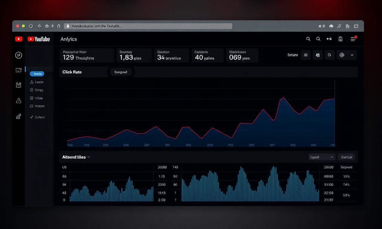
A/B testing thumbnails in 2026
YouTube's official multivariate thumbnail testing rolled out to all creators in 2024 (documentation here). You can upload up to three thumbnail variants and YouTube will rotate them, eventually picking the winner by CTR. Two practical tips:
- Test one variable at a time: same cutout, different background color. Otherwise you can't tell what won.
- Give each test at least 7 days. CTR varies by day-of-week and recommendation cluster.
File format and size
YouTube accepts JPG, PNG, GIF, BMP up to 2 MB. Use JPG at quality 90 for photographs, PNG for designs with hard-edged graphics or text-only thumbnails. WebP is not yet accepted by YouTube's uploader, even though the player serves WebP to viewers — see PNG vs WebP for transparent images for the broader format discussion.
Common mistakes that quietly kill CTR
- Tiny text. If you can't read it on your phone from arm's length, viewers can't either.
- White halos around the cutout. Re-export at higher resolution; consider a 1-pixel inner shadow to hide thin halos.
- Background color that matches YouTube's UI. Pure white or pure dark grey blends in.
- Clickbait that doesn't match the video. Watch time tanks; the algorithm punishes you twice.
- Reusing the same template every video. Pattern interrupt only works while it's a pattern interrupt.
Batch production for serious channels
If you publish more than once a week, build a Photopea or Canva template:
- Background layer (color or gradient).
- Cutout placeholder (smart object).
- Text layer with predefined font and stroke.
- Optional logo / watermark in a fixed corner.
Each new thumbnail then takes the time of one cutout (5 seconds via MagicBG), one drag-and-drop, and one text edit. Five minutes max from photo to upload-ready JPG.
Get started
Generate your first transparent cutout on the MagicBG home page, drop it onto a 1280×720 canvas in Canva, add three words of bold yellow text with a black stroke, and publish. The first thumbnail you make will already outperform 80% of what you scroll past on YouTube tonight.